A couple of weeks ago, The Economist published a great article pointing out how practically all large social networks are moving towards the TikTok model — filling your feed with videos based on the whole universe of content out there, not just things your family and friends create and like (what they call the ‘interest graph’ instead of the ‘social graph’).
This is a huge departure from the early days of Facebook, when you’d write a status update and get a bunch of likes and comments from people you knew.
But media type (e.g. video) and graph (e.g. interest) are just two aspects of the social media feed. We need to consider many more aspects if we want to analyze how social media feeds have changed over time — and how the TikTok model has ended up as the winner (for now!).
Design aspects, for instance. The Economist is correct that the TikTok model has now been widely adopted, but not just interest graph and video aspects — the killer design combination of full-screen, infinite scroll, autoplay has been copied too. It’s all part of a package.
That’s why I’m working on a typology of the social media feed. Typology is a word I hesitate to use, because it sounds like bullshit. But it’s the best way to sum up what I’m trying to do, which is:
Identify and classify the different aspects of social media feeds and posts
Does this kind of typology already exist? Almost certainly, and I’ll be sifting through the academic literature to find precedents to build on.
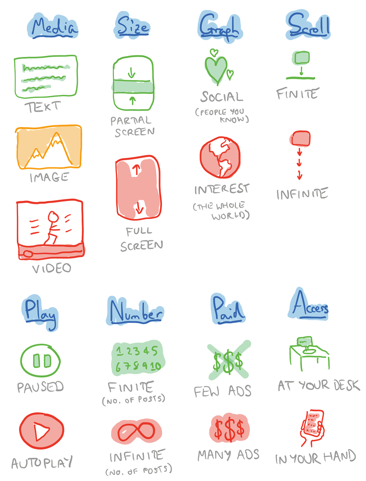
But for now, here’s an early sketch:
I’ll go into detail in my next post. A couple of notes though:
We have moved towards red over time (that’s where TikTok’s full-screen, infinite scroll, autoplay video sits). And it’s amazing to me that some of the things in green, like finite scroll and access mainly at your desk, now seem positively quaint.
I’m aware there’s plenty of room for improvement. For instance, ‘Number’ feels a little redundant when ‘Scroll’ says something similar — and a simple typology can’t capture the nuances of e.g. feeds that comprise images and video.
I’ll be writing a few posts based off this:
An in-depth look at the typology. Pack out what I’ve got here, make it more robust and defensible, lay out the limitations, compare it to other typologies I find in the academic literature. But all in a fun way.
The evolution of social media over time, using this typology. This’ll be a great opportunity to re-use the nice icons I’ve drawn. What does Facebook 2004 look like compared with Facebook 2019, and now Facebook 2024? Which parts of social media history contributed to shifts in aspect, for instance autoplay becoming normalized?
The philosophy of the typology. Sorry for the word salad. But I’ll be asking you the question: if you had a menu of this typology, what would you choose? What does it mean that most of the time, you actually don’t get a choice at all?
The future of the social media feed. What comes next after red? If we went from text, to image, to video — what else do we even have? (Scratch ‘n’ sniff cards?) How will AI affect this all? Obviously I have to say something about AI, come on.
If, like me, the word ‘typology’ sends you to sleep, just substitute it for ‘napalm-blasting Godzilla-King Kong hybrid monster’ and that should give you the energy to read the upcoming posts.
Back soon with my in-depth look at the napalm-blasting Godzilla-King Kong hybrid monster — buckle in, it’s gonna be one helluva ride!


I think the way that these businesses are structured plays a significant role in how they view and engage with their user base (probably an obvious statement). What if revenues and profits were secondary to user experience (and by experience I mean prioritising the users values and overall quality of life)? We’d hopefully see less of the reds because I’m sure if you asked people whether they’d like to spend hours on their phones stalking random people they don’t know vs invest time in pursuing a passion or catching up with a friend the answer would be the latter. I think social media has made us (the user) the commodity instead of the customer and that’s not how it started out. If we had more input into how we’d like to consume content this would be better for us but worse for the social media companies (presumably).
I think this is interesting (especially the menu point - what would we choose?), and makes me think that the graph (social vs graph) thing is a cousin of a wider category of 'JTBD' (Job To Be Done): why am I here? Over time it seems we've moved from 'communicate', 'find out what's going on (and the FOMO it might entail, sure)', 'get details for the party', 'remain in loose touch' --> 'be entertained', 'be jealous/boastful', 'kill time on the bus'. Which really makes me wonder why we lost Facebook as a core tool. What actually happened to make me stop using it? Well, enshittification i guess. I still want to go to events, and see what interesting stuff people are up to/writing/sharing, but that's now harder and more fragmented. Meanwhile, the product that did that job increased its ad load, and moved to algorithmic feed in order to monetise. But doesn't that JTBD of 'general social network' actually still exist, underserved? I'd love your take on the _why_ of this, and the mix of economic, social, etc that means no one has created a genuine competitor product that's taken off in an way, with a social graph at its core rather than an interest one.